Information Architecture pioneer Richard Saul Wurman’s claim that a “weekday edition of The New York Times contains more information than the average person was likely to come across in a lifetime in seventeenth-century England” seemed a bold assertion when he made it. The world has changed since 1989 and the amount of information we process, forming the basis of our opinions and decision making, has grown exponentially and it’s only going to increase. Because of this, data visualisation work like David McCandless’ ‘Information is Beautiful’engages, persuades and provokes – something data alone might struggle to do. A good example is one he created on the scientific evidence of health supplements and other ‘miracle foods’. Through direct comparison, we can see how they stack up on a scale of strong evidence to harmful.
David's varied background included stints as a programmer, journalist and designer and all combine to make him one of the leaders in the field (and you can’t get much more 'thought-leader' than giving a TED talk).
Earlier this month I attended one of his ‘Workshops are Beautiful’ sessions in London.
Though it may seem as though it is data visualisation isn't new – we can go back to the 18th century when they were used to illustrate trade balances while one of the most effective in terms of storytelling has to be Minard’s 1869 map of Napoleon’s Russian campaign charting the number of troops advancing on and then retreating from Moscow (inspiring in one biographer “bitter reflections on the human cost of the thirst for military glory”). Despite this, the rules are still not rigidly defined and experimentation is rife so while David admits to having no formal training in graphic design, he does contend that, through constant exposure, we’re all design literate and by practice and repetition we can see what works and what needs improvement.
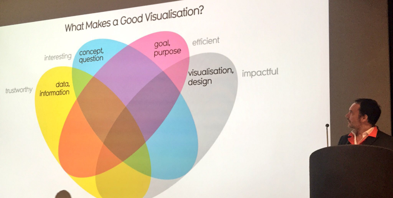
In this workshop we were taken through the process of creating a visualisation – starting with a seed idea before considering the goal of the visualisation. Like any narrative device, visualisation is about choosing what we want to say and the way we say it - whether through the data we use or the visual tone we set and, not surprisingly, we must be cognisant of the audience we are designing for.

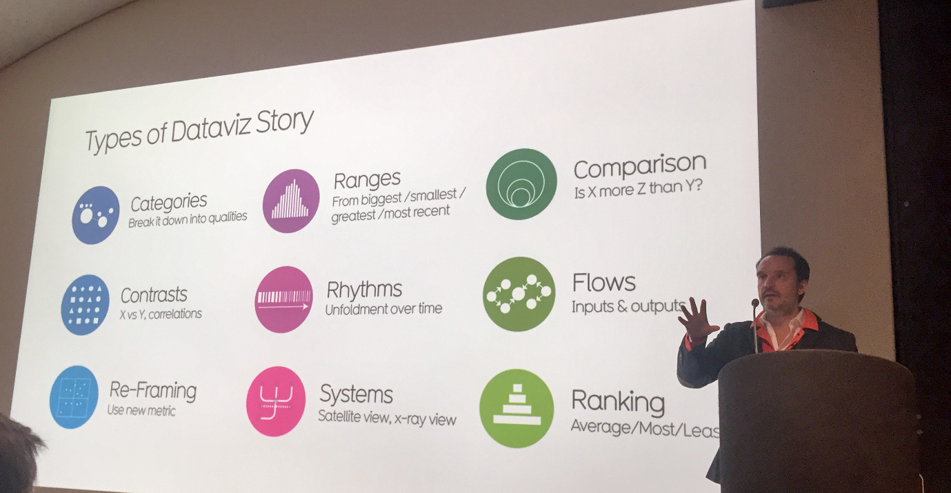
Through ‘Negative Concepting’ we explored a way of generating visualisation concepts through inversion. By beginning with something we may find boring, annoying or have no understanding of we identified the primary metrics of what we want to measure. Once we have those we can select the type of story we want to tell – is it based around quantitive or qualitative comparison and what type of chart style we use.

While the workshop didn’t extend to seeking out and manipulating the data it did provide techniques to help us think about ways we can use data to provide insight, challenge misconceptions or even make someone smile.