
Two participants prototyping an innovative feature for WhatsApp, six months before the messaging giant released an almost identical functionality, is a clear illustration of the industry-optimised and innovative skill set offered by Digital Skills.
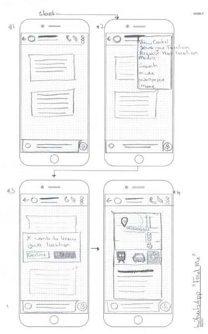
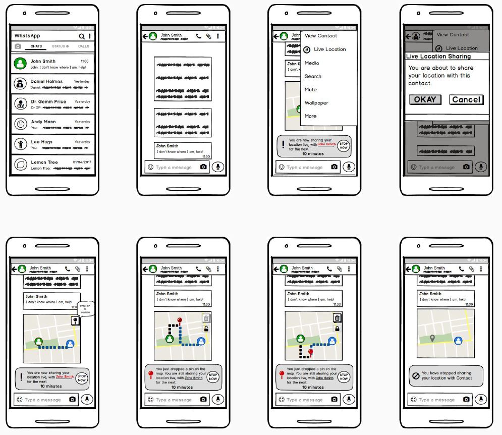
As part of their User Interface Design module, the two BSc Honours Degree participants developed a “Live Location Sharing” feature for WhatsApp, enabling users to share their real-time location, with members of a given conversation and for a specific period of time.
We spoke with John Jordan, one of the two project designers, about his experience. We also interviewed User Experience Analyst and Digital Skills lecturer Peter Berends about how the higher education institution is equipping participants with the real-world guidance they need to succeed in User Interface (UI) design, which governs how users interact with digital devices and systems.
We developed all phases of the project: from identifying the new feature idea, establishing the project scope and creating wireframes to testing the functionality with real users and delivering a fully functional prototype.
I suggested “Live Location Sharing” for a couple of reasons: I thought it would be a useful feature to have, and given the time constraints of the project, we needed something reasonably straightforward, which could be prototyped and tested with users within a month.
When it comes to proposing new ideas, I’ve always found it easier to start with problems that need solving, and work backwards to a feature that would solve them - rather than trying to dream up some completely new feature, without any context for its use. It is easy to think of problems – our everyday life is full of them – but trying to think of a new idea can be more difficult.
Giving participants the ability to understand how contemporary design problems are solved is a big part of our module. We first give participants a set of “User Interface Design spectacles” (called UI design principles) to look at the world and understand which UIs are well designed and which ones are not. They also learn to understand why certain experiences are bad design and create unwelcome challenges for users. Once participants have gained this understanding, we discuss and analyse contemporary UI challenges.
Yes, absolutely. My learning from the course material was essential to this project. I got an excellent introduction to the principles of User Interface Design through the various lectures and workshops. These principles are straightforward – keep things as simple as possible and conform to the user’s view of the task – but it requires discipline to stick to them.
One thing Digital Skills lecturers repeatedly emphasised was to follow a user-centred design process. You are not designing an interface to impress yourself, but to allow users to achieve a goal. You select user interface elements based on how effectively they enable your users to achieve their goals. It almost doesn’t matter if you like them or not.
We actually welcome the challenge in our module by lecturing trends together with principles, and discussing common problems and solutions. Once participants have a good understanding of contemporary UI challenges, they work on hands-on projects and focus on their own user interfaces. They take on a design challenge in their desired area. They have to work with the current limitations for that specific platform or device and test it in a real-world environment. We then assess and benchmark their project against top UIs for that specific task/audience.
We followed a build-measure-learn methodology. Essentially, we made some initial assumptions about how the interface would work, then quickly built a wire-frame prototype and tested it with real-life users. We measured their responses, assessed any issues they had with the initial interface, and then incorporated their feedback into the next iteration of the design.
I created a user-testing process, with an introductory script to provide context, a task list and various questions for the users. These questions were crucial to the learning cycle, and they were designed to gain qualitative insights into a user’s behaviour when using the interface. While seeing users hover over an icon for five seconds might be interesting, it is vastly more useful to know the reasons why they hovered over that icon, rather than clicking it straight away.
After each round of testing, I reported to my teammate and amended the prototype based on the results of the user testing. It was a scientific approach to interface design. It involved the repeated testing of design assumptions (our “hypotheses”), with design decisions being made with validated data, rather than based on our opinions.
I always adopt an “expect the unexpected” approach to user testing. But the feedback we got from the prototypes was broadly in line with what we expected. For example, in the initial prototype, I set free my inner-artist and created custom map markers to represent both users broadcasting their location and users en route to the broadcasted location.
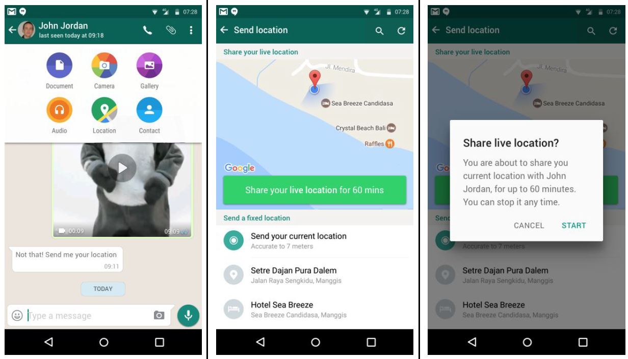
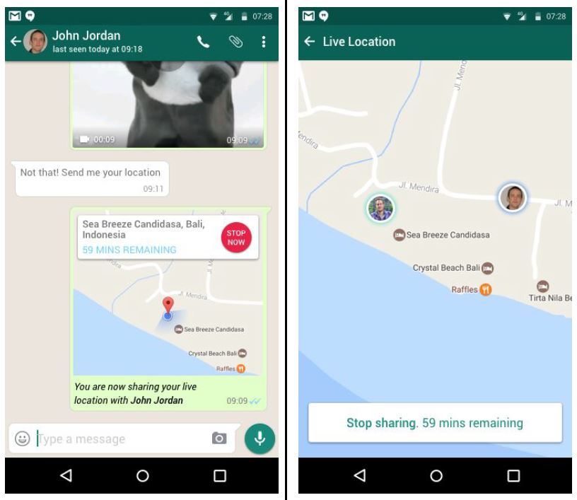
But different people interpreted these custom markers very differently, so we quickly ditched them – they were inherently ambiguous and just created confusion. Instead, we went with profile images of the users, overlaid on the map, which was clear and informative. Incidentally, this is how WhatsApp implemented the feature in October 2017.
Overall, it was encouraging to hear so many users say that the “Live Location” feature was a great idea and something that they wanted to see – six months before WhatsApp actually rolled it out!
Yes, most of it. Any user interface element that caused confusion was removed. Most users had the same concerns and comments. For example, all users wanted some sort of time limit on the live location sharing. They also wanted some sort of indication within the app that they were sharing their real-time location.
However, I did not integrate all the feedback related to expanding the core feature we were creating. People can often champion features that they personally consider very important, but that other users don’t want or need - such as allowing WhatsApp users to specify multiple locations and letting the users “vote” on the preferred location to meet.
It's important to avoid “scope creep” in any project, where requirements change or functionality is added at a late stage. While it is tempting to try and fulfil all feature requests from users, you must remain disciplined. We adopted the principle of designing one feature very well. A feature that every user needed, rather than poorly implementing a range of features that only a few users wanted.
What was particularly interesting was the team’s ability to understand what is relevant to users. They accepted the challenge to innovate by designing a non-existent feature for WhatsApp. This required them to ensure their designed UI was behaviourally and visually consistent with WhatsApp.
WhatsApp is often called the best messenger in the world. So they needed to ensure their work was of the same quality as WhatsApp’s UI. In their design journey, they identified real UI issues when testing with users and solved these in ways that were almost identical to how WhatsApp actually implemented live location sharing. This clearly proved they understood the concepts we taught them. They created excellent work.
Yes, absolutely. The learning I gained from this project has been invaluable in my daily work. I work in a digital health start-up and I have overseen the design of two critical projects. The first project was our iOS app, which allows NHS patients to order and track their medicines. The second was a web interface for pharmacy staff to update the status of a patient's order as it moves through the dispensing process.
For both of these projects, I undertook the user testing following the “build-measure-learn” method, with user feedback being incorporated into the design of the product.
For our NHS patient iOS app, two distinct user interface styles were considered. The decision between the two designs was made based on the data I gathered through user testing. The skills I developed during the WhatsApp project helped me conduct these user tests to a very high standard and effectively communicate the results to management. This ultimately enabled data-driven design decisions to be made.
I have definitely built up confidence from my previous WhatsApp project. I know I can deliver these user tests to an excellent standard and use the results to make informed design decisions.
I would say the User Interface Design/WhatsApp “Live Location” project stood out for me as an academic exercise that had real practical benefits. It really helped me develop my skills to a point where I am confident in designing and developing an effective user interface.
I really enjoyed the entire process of initially conceiving a design, then taking that design to users and seeing what happens. In the same way that “No battle plan ever survives contact with the enemy”, to paraphrase Field Marshall Helmuth von Moltke, I found that “No user interface survives first contact with users”.
You have to be excited by the prospect of users breaking your design as this will ultimately lead you to a more robust design. And it is exciting to see the iteration of your designs, to solve a design challenge through incremental improvements, guided by user feedback. I found a real satisfaction in seeing people use our interface to achieve their goals and I look forward to designing more interfaces in the future.